Onboarding Flow
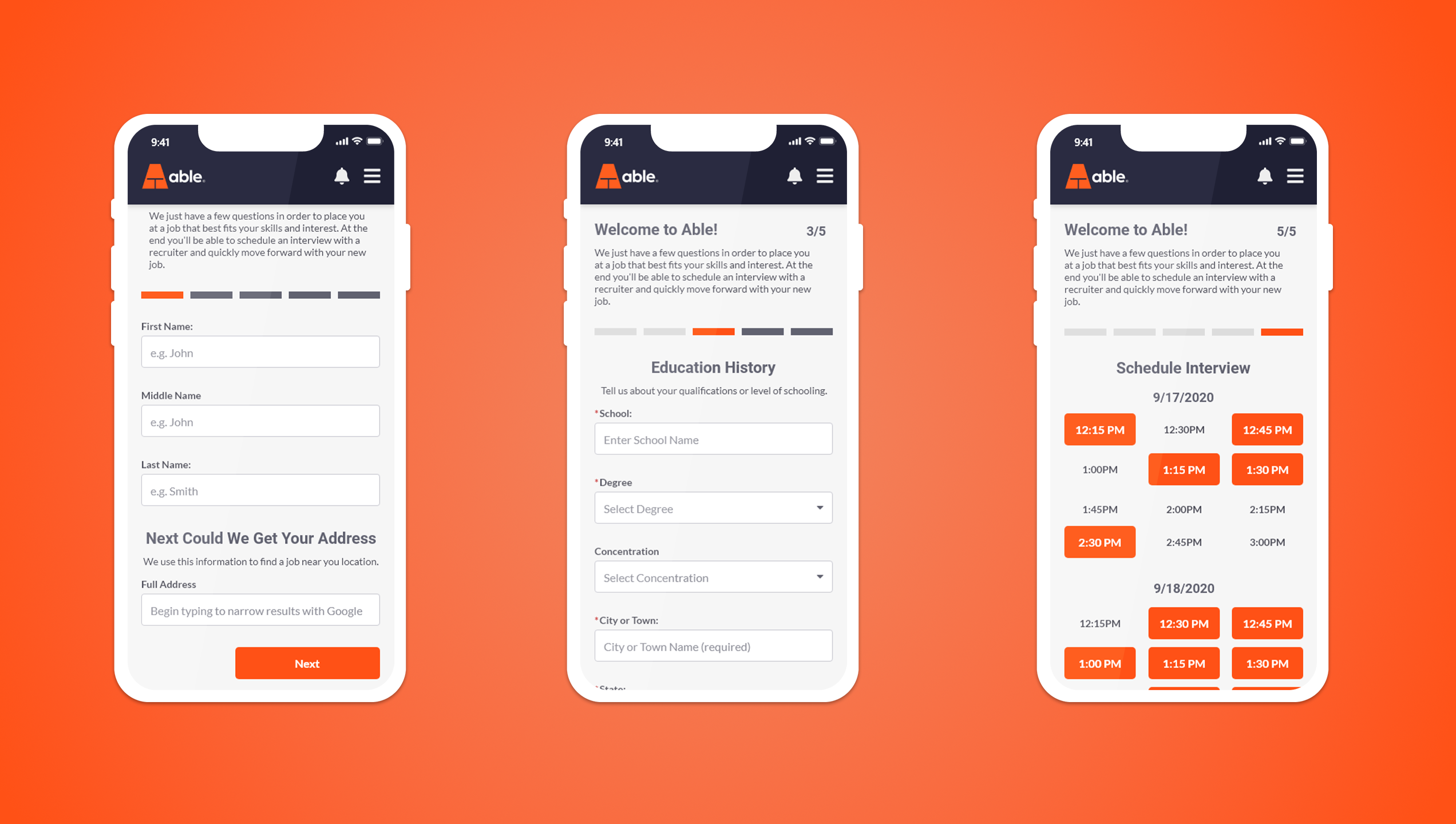
A few of years ago, while designing an onboarding app for recruiters, one of the areas I was most excited about was a configurable application route. The goal was to create a fixed sequence of screens that could be customized by each recruiting firm allowing them to tailor how new candidates were brought into their system.
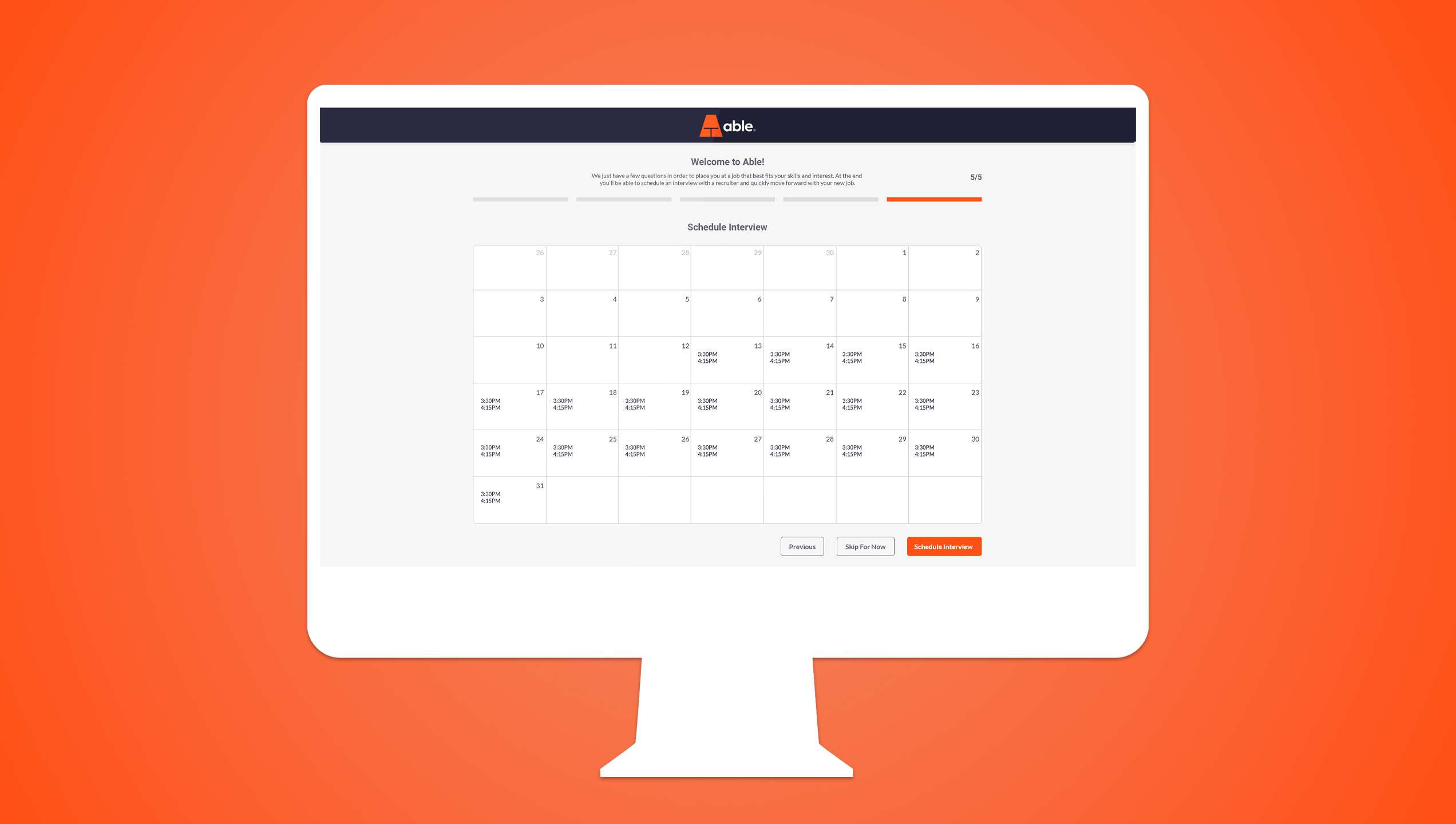
The flow would clearly guide users through collecting essential information (like education, experience, and contact details), and then seamlessly transition into scheduling an interview. It was designed to feel both structured and personal a balance between efficiency and a branded experience for each firm.
This concept was heavily focused on mobile, since many candidates complete onboarding steps on their phones. The layouts were designed to adapt naturally to smaller screens, using stacked content, larger tap targets, and progressive disclosure to avoid overwhelming users. The goal was to make the experience quick, intuitive, and accessible from anywhere.
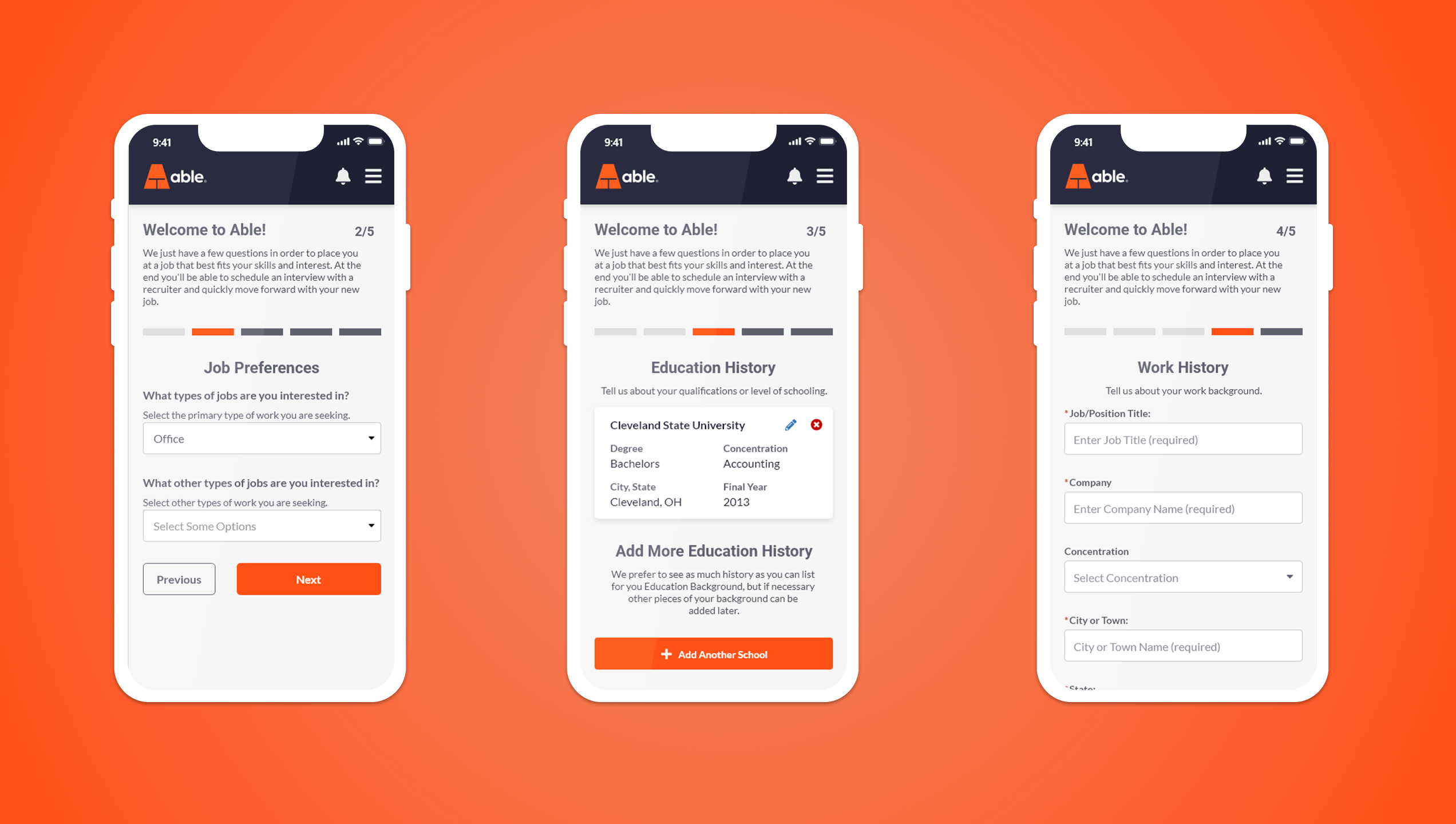
From a UX standpoint, the challenge was creating flexibility within a fixed framework. I explored how admins could adjust content and required fields without breaking the core user journey. The visual design used clear progress indicators, modular layouts, and inline validation to keep the process simple and transparent.
Unfortunately, this concept didn’t move past the mockup stage due to time and technical constraints early in the project’s development phase. Still, I found it to be one of the more compelling parts of the onboarding app a concept that, with more time, could have delivered real value to both recruiters and candidates.
Even though it remained in concept form, it stands as a strong example of thoughtful design from an earlier project and one that still feels relevant today.