Designing Bullhorn Analytics’ first dashboard experience from the ground up.
A fully customizable, recruiter-focused dashboard built to replace a static landing page. Created through user research, remote design sprints, and tight collaboration with global teams—launched during Bullhorn’s most-attended customer webinar ever.
Starting from Zero
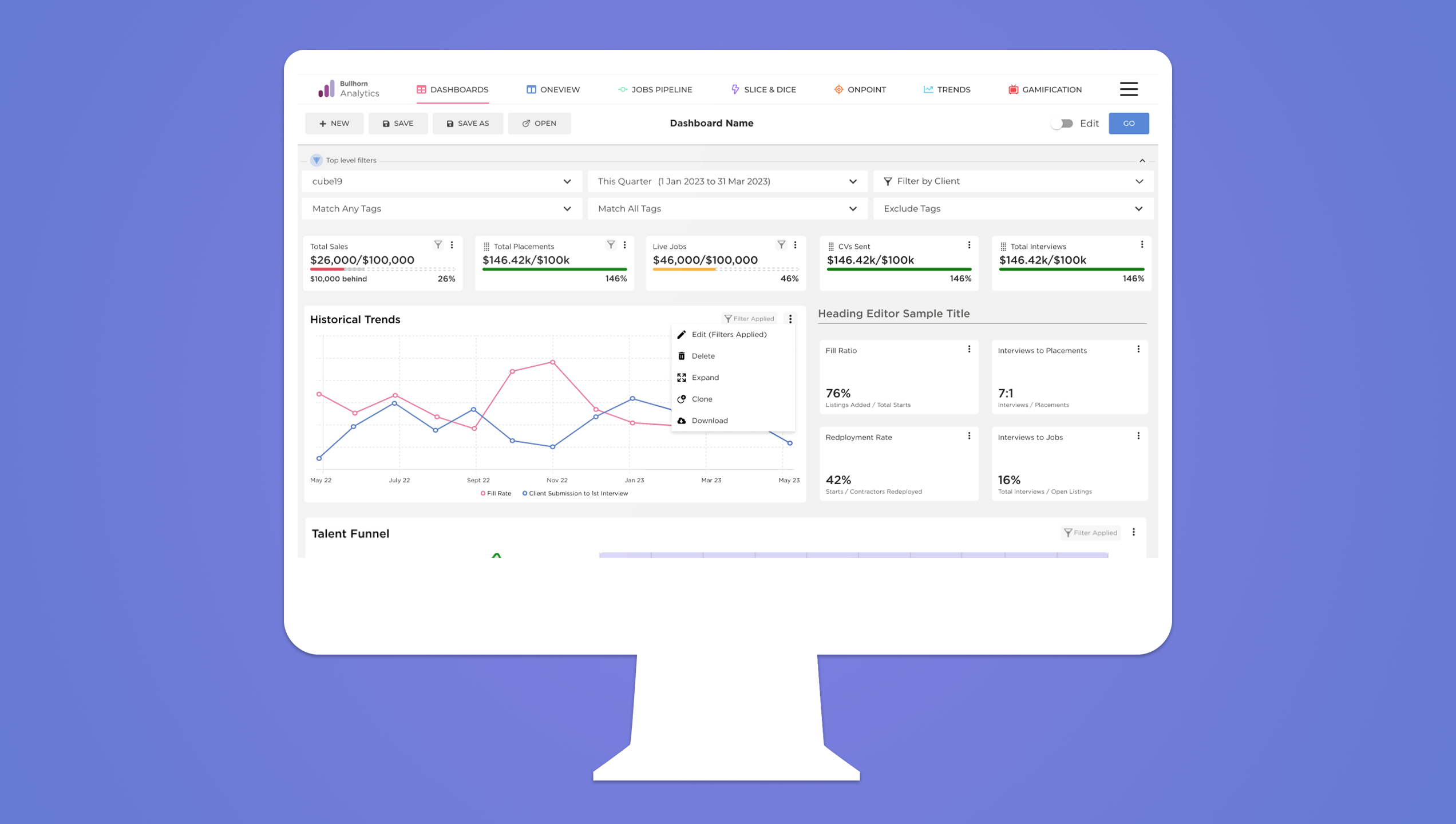
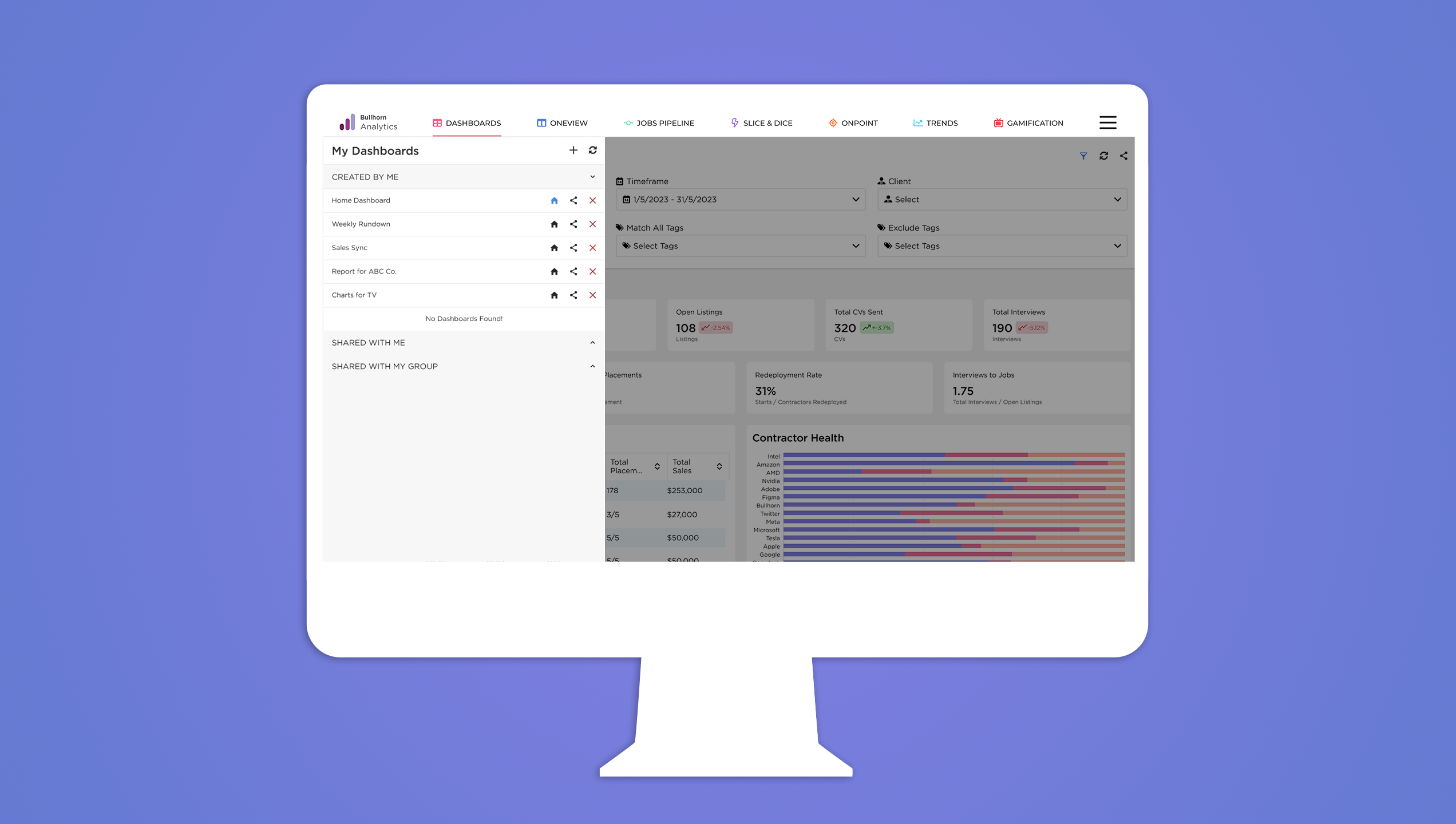
Bullhorn Analytics, previously Cube19 had been a previous acquisition in the midst of further integrating itself with the Bullhorn ecosystem. There was no existing dashboard only a table-heavy landing page with basic metrics. This was also the first UX-led initiative for the product.
The challenge was clear: design a modern, flexible dashboard experience that worked for recruiters, managers, and executives. One that could be personalized by role, respected the constraints of existing systems, and integrated cleanly into the larger Bullhorn ecosystem.
Building Trust Across Time Zones
The project kicked off with a small cross-functional team, split between the U.S. and London. I co-led design with another UX designer. Soon after kickoff, both the PM and PO rolled off the project.
From that point on, it was about building momentum and trust across time zones, dev handoffs, and shifting priorities. We stayed connected through weekly design reviews, async Slack threads, and regular one-on-ones with developers to make design decisions quickly. Over time, the team leaned more heavily on design, even looping us into conversations about future planning.
Research that Shaped the Foundation
We began with 10 customer interviews, using open-ended scripts to surface real pain points. These conversations were recorded, transcribed, and mapped through sentiment analysis into themes.
Recruiters wanted:
– Clearer data, faster
– Dashboards tailored to their role
– A visual system that matched the main app
– Less time pulling reports that didn’t reflect what they cared about
We also worked with internal account reps to recruit the right mix of participants, which helped us build a foundation of users we’d later return to for validation.
Design Dash to Ideate
To jumpstart ideation, we hosted a remote design dash with team members from product, analytics, and engineering. We started with an icebreaker: everyone shared the worst solution they could imagine. (Print the charts, send updates by carrier pigeon, etc.)
This helped break down hesitation and boosted internal buy-in. During Crazy Eights, one concept stood out, a wizard-style onboarding flow to help recruiters quickly create their own dashboards. It wouldn’t make the first release, but it shaped how we thought about setup and personalization.
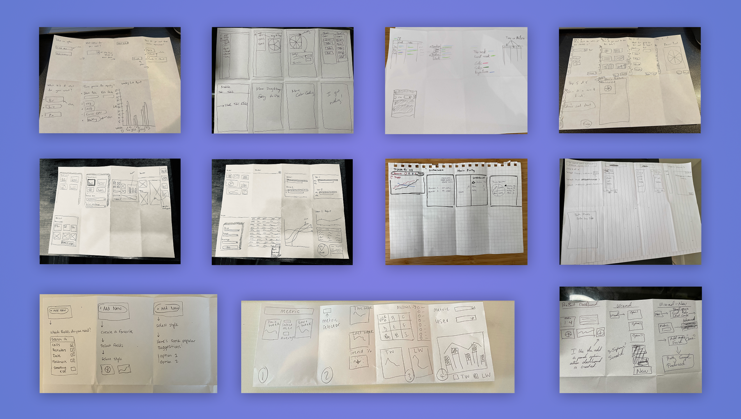
Iterations
As we moved into design, we held weekly working sessions with the development team and broader UX org.
With the dev team, we talked feasibility, charting limitations, interaction complexity, state handling. With the UX team, we focused on consistency, button behavior, component reuse, and where we’d need to evolve existing patterns.
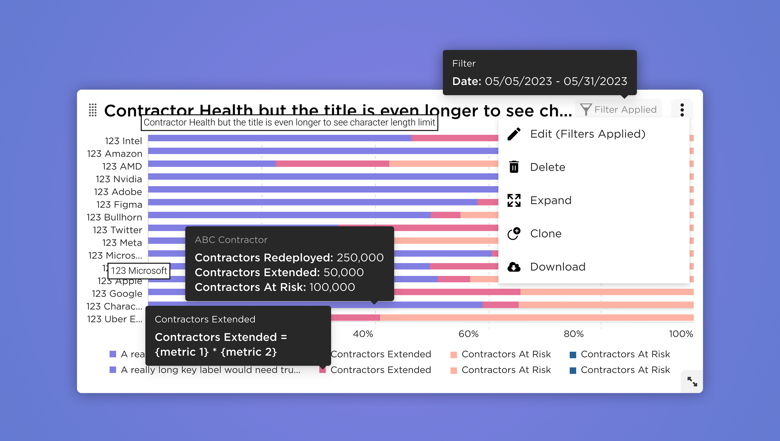
States mattered. So we mapped everything: hover, click, edit, share, confirmation, empty. These details made the dashboard feel considered and responsive, not just a shell around a chart.
Designing within Constraints
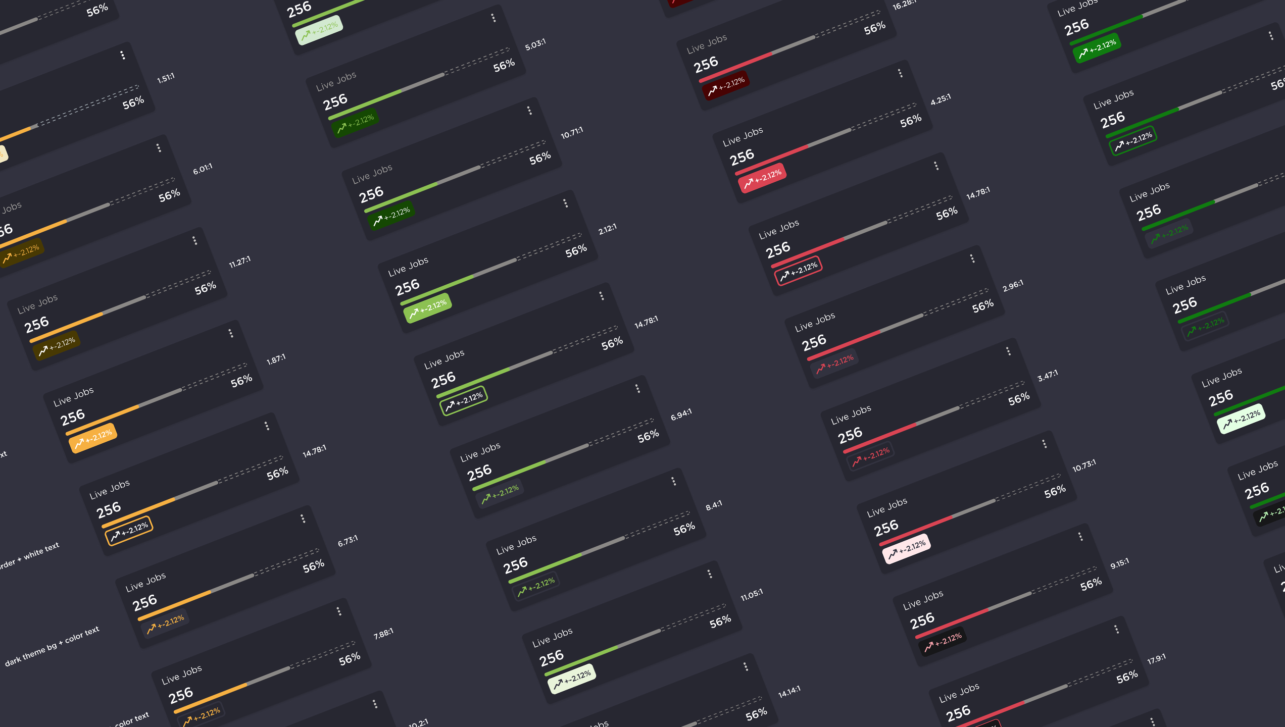
Our charting library was pre-selected. The component library was still evolving. Theming had to match the broader Bullhorn platform, which meant creating both light and dark versions from the start.
Analytics was one of the few Bullhorn products already using dark mode, so we designed with that as the default. To ensure accessibility, we introduced a color-blind-safe gradient palette for charts, a first for the platform. We also added brand-new components for data display and interaction, all documented in Figma with usage guidelines for future teams.
Validation with Real Users
We built a focused prototype with simplified flows and tested it with 10 users. Unlike the research round, these sessions gathered both qualitative and quantitative feedback. Users were asked to complete tasks and rate ease of use, helping us assess confidence levels and flag weak points.
What we learned:
– Users appreciated the flexibility and visual clarity
– Default layouts helped with setup, even without the wizard
– The design felt like a real extension of the Bullhorn ecosystem
Launching with Impact
The dashboard was introduced during Bullhorn’s most-attended webinar in company history. Gainsight PX was used to guide new users through setup and collect behavioral data.
Initial engagement was high, and we started seeing real usage patterns emerge across different types of recruiters. The design gave teams ownership of their data views—and gave us new insight into what they prioritized.
Final polish
Post-validation, we refined the design, adjusted a few interaction patterns, and cut low-priority features like the setup wizard for the initial release. All new components were added to the Figma library, with documentation and rationale included to support future work.
What’s Next
We’re continuing to monitor adoption through Gainsight PX and targeted feedback sessions. Our goals now include:
– Reducing setup friction for new users
– Revisiting delayed features like the setup wizard and pie charts
– Identifying ways to simplify complexity without losing flexibility
What I Took Away
This was a project about building trust between teams, between users and a new UI, and between design and data.
Starting from zero is a challenge, but it also creates space to get it right. Listening closely, validating often, and designing with flexibility in mind made this dashboard something that could grow with the product not just launch with it.