Improving white label UI with opacity
This was an exploration I did for Able a while back that never happened so I can share this now. I was trying out some ideas I had for how you could use white opacity to more effectively include client brand colors within the product. While there was only occasional sentiment around improving brand identity within the product I think I may have taken it to 100 here with how much the brand color would get used on that login page!
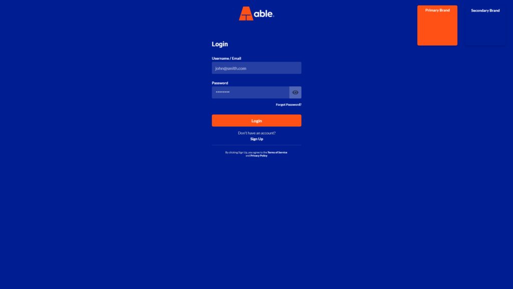
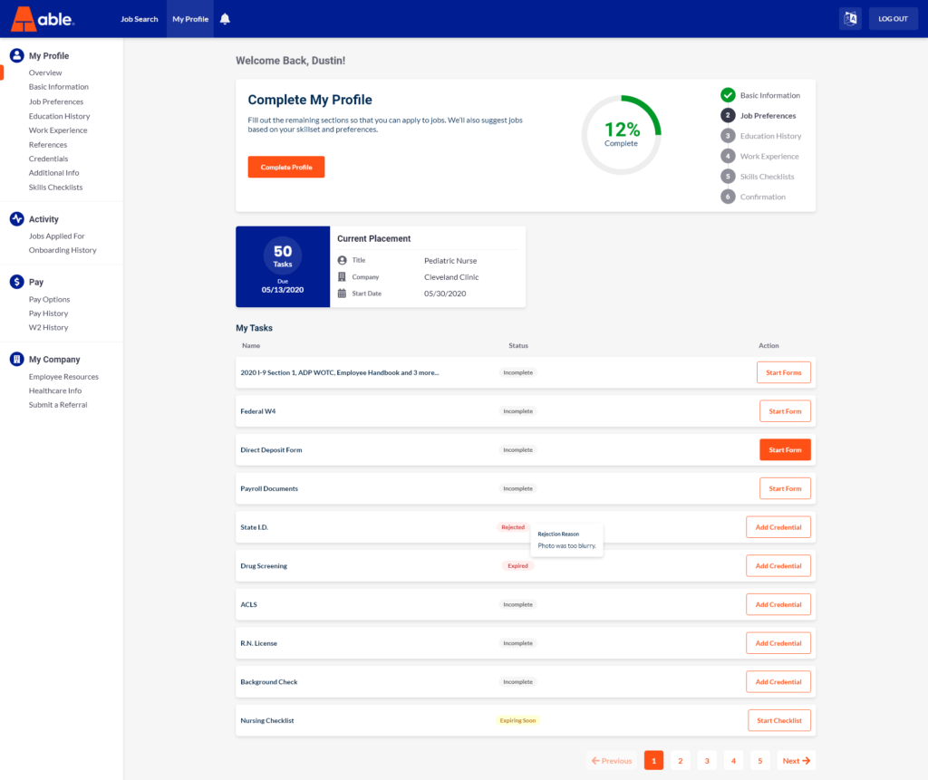
The inputs are made white here to stand out on any darker secondary color however in order to expand the color palette text colors would still have to shift to meet WCAG contrast standards or we would have to constrict the colors to only being darker. Additionally, I think there are still some other contrast issues that could potentially arise here.