Designing My Website
I’ve wanted to write this article for a while. The brief for this project was simple: to design a new portfolio website for myself.
I quickly realized that problem with designing for yourself is that if you do not have a stop date in mind you can carry on endlessly designing dozens of page variations. Thankfully, after only a few failed attempts I came up with a plan. I drew up wireframes, pre-made content for pages/mockups, and I managed to keep myself to about 2 weeks of designing and redesigning.
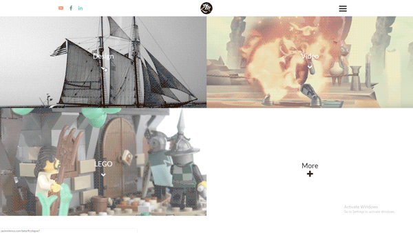
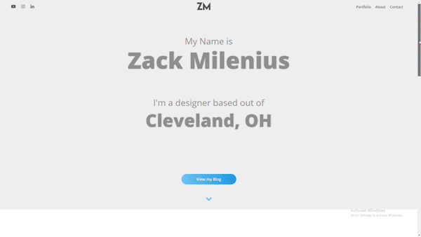
But, before we really dig into this project here are a couple of the projects that didn’t end up working out before I started the site you see now.
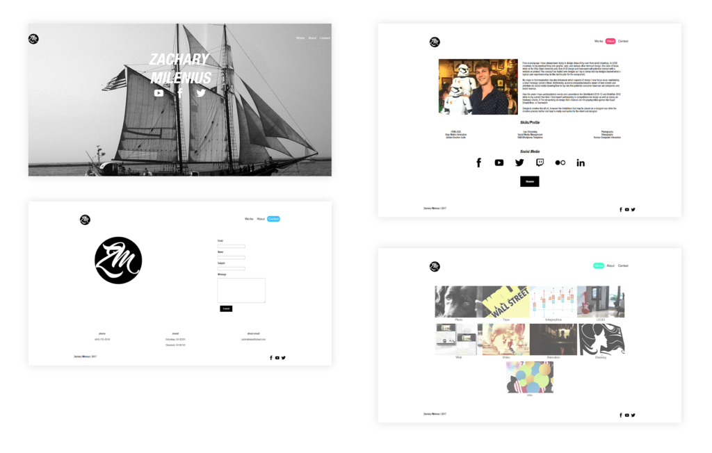
My original site was created roughly 2 years ago as I was getting prepared to start applying for my first jobs. My experience with HTML/CSS was… undeveloped and in that time I have been able to practice A LOT. That original site was incredibly minimal mostly by choice. (HA!) I wanted to keep my site fairly plain to let the work do the most of the talking and best draw the eyes.
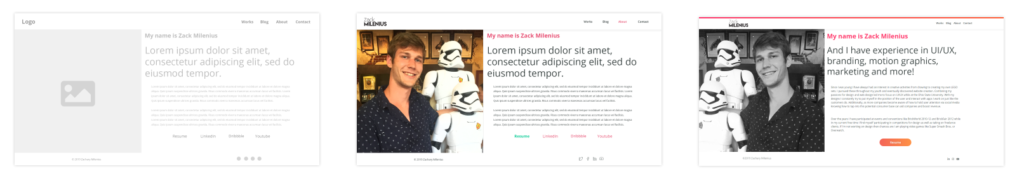
The home page remained mostly unchanged throughout. A lot of it was pulled from the designs above that didn’t end up working out. One change was moving the blog link into the nav, and using some of the space in the “hero” section to describe myself. From the hi-fi to final I also added some saturation to the colors and standardized all icons to one of my favorite sets, FontAwesome. I also decided to ditch the “roles” that I perform at the bottom of the hero since they didn’t add to the page that the description didn’t already state.
The about page went mostly unchanged from initial mockups to final design, however I ended up removing the social media links since they are above the fold on most desktops and my mobile nav includes them. I thought this would help bring attention to the main point of the page, housing my resume.
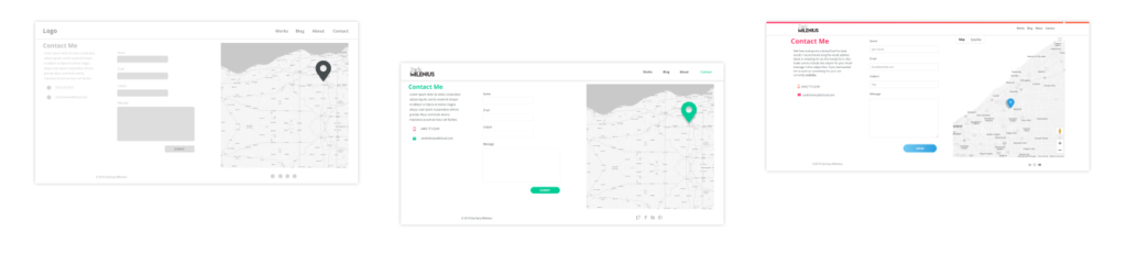
The design of the contact page didn’t really change, except before the contact page went live I decided to consolidate the amount of colors on the site. The green used in the mockups didn’t end up making the cut since it blended the least with the red I decided to focus the site around.
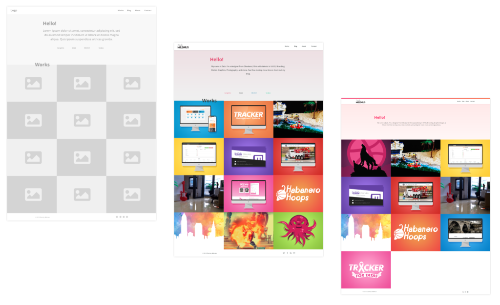
Left to Right: Lo-Fi Mockup, Hi-Fi Mockup, Final Implementation
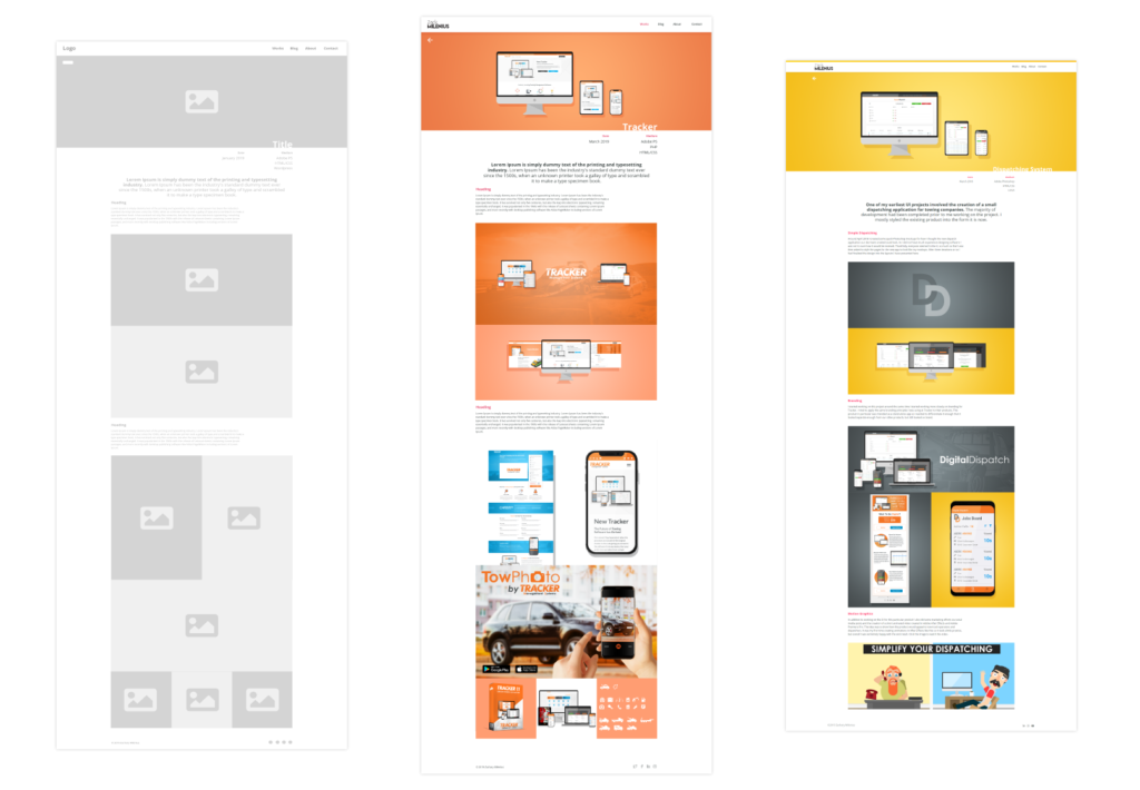
The portfolio pages went unchanged, woohoo for awesome mockups! I really liked how these pages turned out as they can extend as long as I have content and leave plenty of room to write descriptions.
Left to Right: Lo-Fi Mockup, Hi-Fi Mockup, Final Implementation
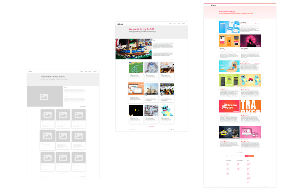
My first time using WordPress for an actual blog! The blog underwent a good amount of changes. I ended up expanding the cards to better showcase some of my designs that the posts focus on. I took the original concept to have WordPress “Featured” posts, but I quickly realized that this most often just applied to the “Most Recent” post anyway. Because of this I took I modified approach using CSS where the 1st and 4th (I hope this will draw more attention to some posts even after they aren’t the most recent) posts would be more prominent on desktop. (On mobile all posts have equal emphasis) Finally, I slightly underestimated how much WordPress offered me when initially doing the mockups. As I worked with it more I realized that I could offer my vistors more. The design changed slightly to reflect that.

This page remained mostly unchanged with the exception of reducing the width of the body content as I thought it better presented my designs (Purely subjective, I know, but it’s my site!). I moved the body content up the page so images of my designs would appear above the fold as well. I also ended up adding a comments section which I had forgotten about in my original mockups.

That’s my site! I hope you enjoyed seeing how I went about creating everything. If you have any questions or suggestions feel free to leave a comment below. I plan on regularly updating the UI of the site with any new idea I may want to test going forward.